Subclause
6.3.2.2 – Characteristics of visual ALARM SIGNALS
ü
The committee considered using the triangle symbol (IEC
60417-5307) with 1, 2 (IEC 60417- 5308) or 3 curved lines to represent the
presence of LOW, MEDIUM OR HIGH PRIORITY
ALARM CONDITIONS.
? Some comments suggested that such symbols were
too similar and would be impossible to distinguish on many displays,
particularly at a viewing distance of 4 m.
? The committee recognized this limitation and
decided to allow other methods to indicate priority. For instance, the visual ALARM SIGNAL representing a HIGH PRIORITY ALARM CONDITION could be coloured red, or placed on a red background. Additional
symbols, letters or words could be added to improve distinctiveness. One
suggestion was to use three identical triangles for HIGH PRIORITY ALARM CONDITION, two identical triangles for MEDIUM PRIORITY and a single triangle
for LOW PRIORITY.
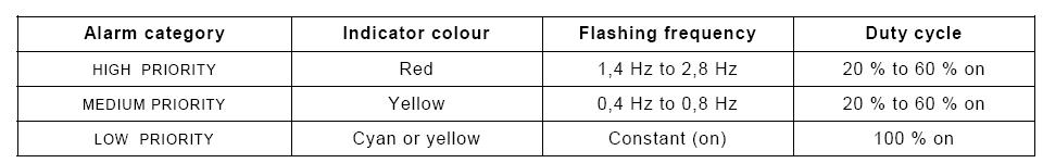
In Table 2, cyan is added as an option for indicating LOW PRIORITY. Differentiating LOW PRIORITY from MEDIUM PRIORITY by colour is an
improvement in USABILITY. Historically, only red, yellow and green coloured lamps were
readily available. A much broader range of colours is readily available today.
The committee has chosen one of the complementary colours that is readily
available.
הערות:
א. צריך
קידוד צורות
למשתמשים שהם
עיוורי צבעים
ב. צריך
לבדוק את
הקודים של
היצרן
בבדיקות
שימושיות